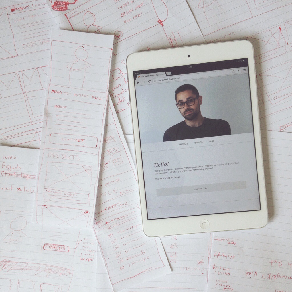
The past couple of days I’ve been building a new portfolio website for myself. The hardest part was getting started so I did some really quick sketches, settled on a layout, then started coding.
I took this photo for Instagram, but it encapsulates the whole creation process so well I thought I’d blog it too.
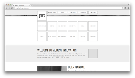
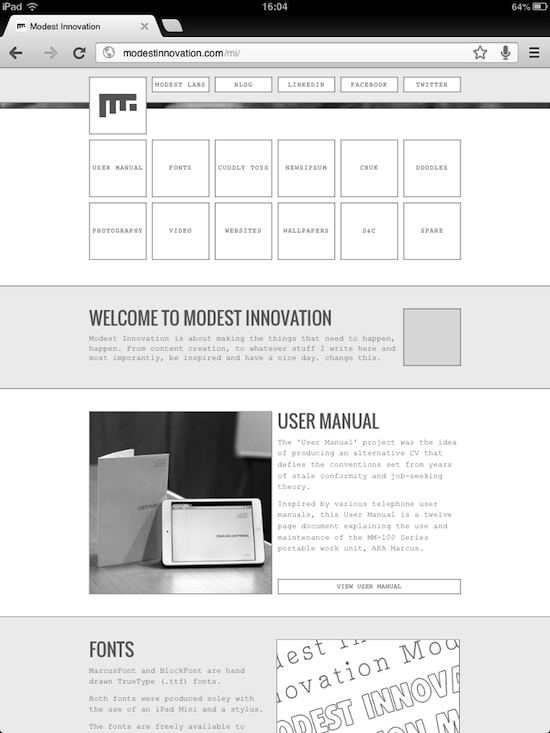
Above are the current (but soon to be outdated) Modest Innovation home page and Projects section. A redesign has been a long time coming. Originally I got them up as quick as possible, I had a vague idea for the design theme being thin borders and grids – it worked on the home page, but that got lost in the projects section.
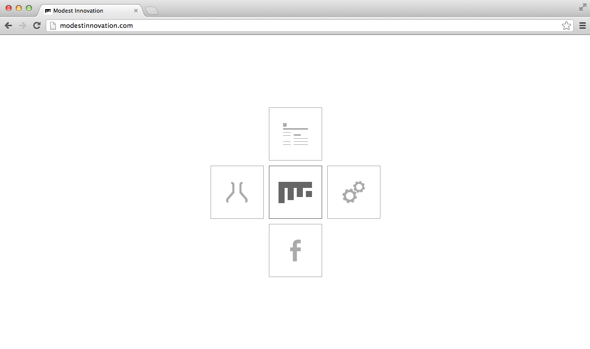
After finally getting round to making a pure CSS version of the Modest Innovation logo, it sparked a new round of inspiration for me to get the redesign and new web build together. I had to sort my act out, and so, after three days of hard graft, it’s almost there.
The simplicity, the thin accent lines and the 1:1 ratio and grid spacing all came together beautifully. Everything needed is on a single page (I love one page websites); projects and project summary, social links, thumbnails – everything. One page.
Shiny new Modest Innovation! (still working on the body copy)l
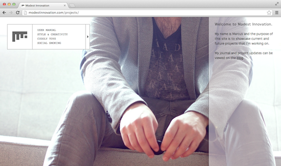
As for the actual content, that’s all hosted on the relevant site for that type of content (videos on Vimeo, photos on Flickr, PDFs on Dropbox, etc).
It’s likely that the site will be live by Monday, if not sooner.
As for its future – I’m working on giving each project its own site, similar to how I’ve showcased my fonts on their own site and User Manual, I’ll continue to do the same with the other projects. I’m also looking to update the blog to inkeep with the new style.
I’ve been wanting to make the Modest Innovation logo a single div element made purely out of CSS (actual CSS version below), instead of an image. This was for a few reasons.
Firstly, I wanted to learn how make CSS icons by calling a single element. My logo is simple so I thought it would be a good starting point. Secondly, once it’s done it’ll save the headache of optimising it for retina display devices.
Lastly, it’s super fast and fucking awesome.
Inspired by one-div I set out to learn about the :before and :after pseudo elements (with the help of Smashing Magazine) and how it all works.
Feel free to use the code and manipulate it over on GitHub.
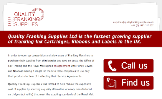
My dad has recently started a company that delivers quality franking supplies (such as ink cartridges, ribbons, labels, etc.) – he needed a website so I said I’d put one together for him.
I designed it as a one page scrolling website, so all the buttons link to another section on the page – it’s by no means a groundbreaking website, but I definitely think it has charm.
I’ll likely put an unoptimised version of the build modestlabs.com and start playing around with some new features. I’m planning on having a showcase style view of all the current projects instead of having them hidden on the server.
Modest Labs; a new stem from Modest Innovation. It’s not just a website – it’s a holder of the hosting that I’ve devoted to demonstrating & experimenting new things. This, and it will also hold websites such as the ones I’m intending to make for deserving small and local businesses that don’t have a web presence (such as bakeries and barbers).
It also has a section I’ve aptly named the Boneyard. A place where projects go to die… or be archived, however you want to look at it. Currently it’s a dead link (how ironic), but it does hold my old blog.
In my constant endeavour to learn more, I am, and have been building a single webpage for use as a little test area. It’s sole purpose is to display useful information about the browser/monitor you’re viewing the webpage on; things like the size of your browser’s window, your screen’s resolution, and some other things that I haven’t thought of yet.
The page is also going to double up as a cross-browser test area – meaning that I can put something new on it, and hopefully it’ll look the same in all browsers (even Internet Explorer, even though it’s shit and I hate it). It also holds no images. Those triangles are pure CSS, a very neat trick found over at CSS-Tricks.com.
So what we’ll have by the end of it, is a useful tool for the public, and a useful tool for me.
Today I built a simple, one page website for my friend Alex Cuff. Simple and beautiful. It uses CSS3 animation to fade in the title and the links and also features his latest tweet at the bottom.
The cool thing (and it’s the first time I’ve given this a try) is that it utilises responsive design. Mobile devices, or screen sizes under 1024 pixels wide, hides the latest tweet at the bottom of the page.