Modest Industries
A digital creative studio specialising in ideas, design and development.
We build in-house products and offer our services to help growing companies.
View ProjectA Modest Company
Modest Industries is a wrapper that allows me to offer all of my services under a single brand. Open to change and quick to react, Modest Industries is constantly evolving and experimenting with new things. But before Modest changes the world, we need an identity.
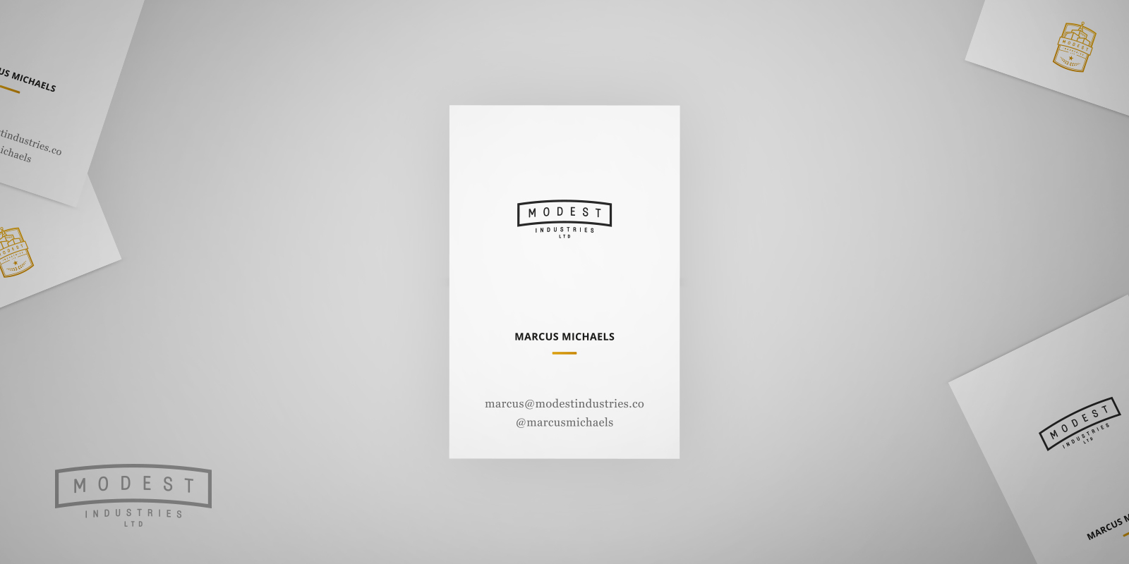
Logo
The original notebook sketches led to the original badge-style logo. In real world usage it's used more as a statement rather than the main logo. For everyday uses the simplified banner logo is mostly used.
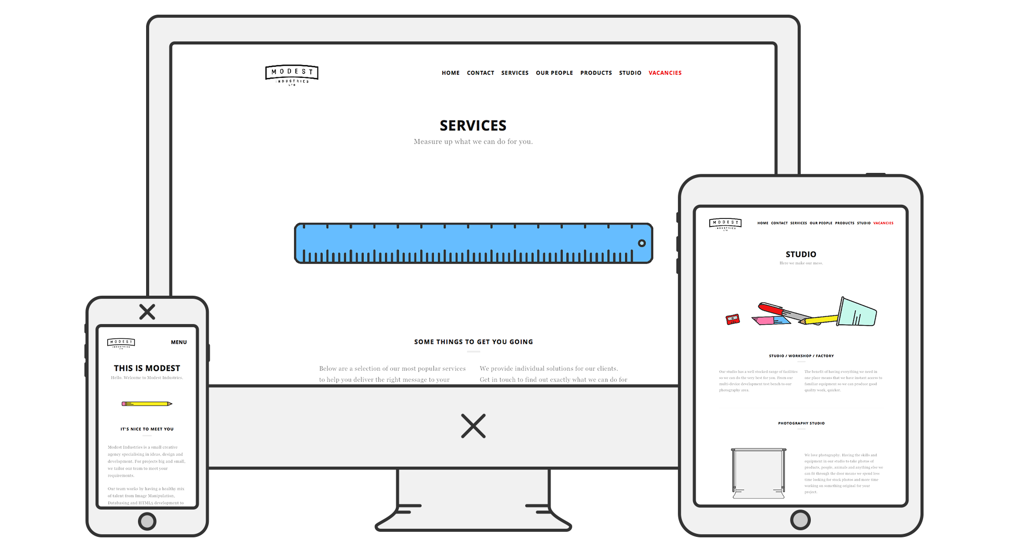
Responsive Design
Making something look good is one thing, but in this tactile, touch-screen world, it's important to also feel good – being usable and accessible. For example, our website was built mobile-first to look and feel great on as many different devices and across as many different screen sizes as possible.
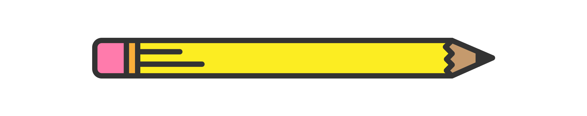
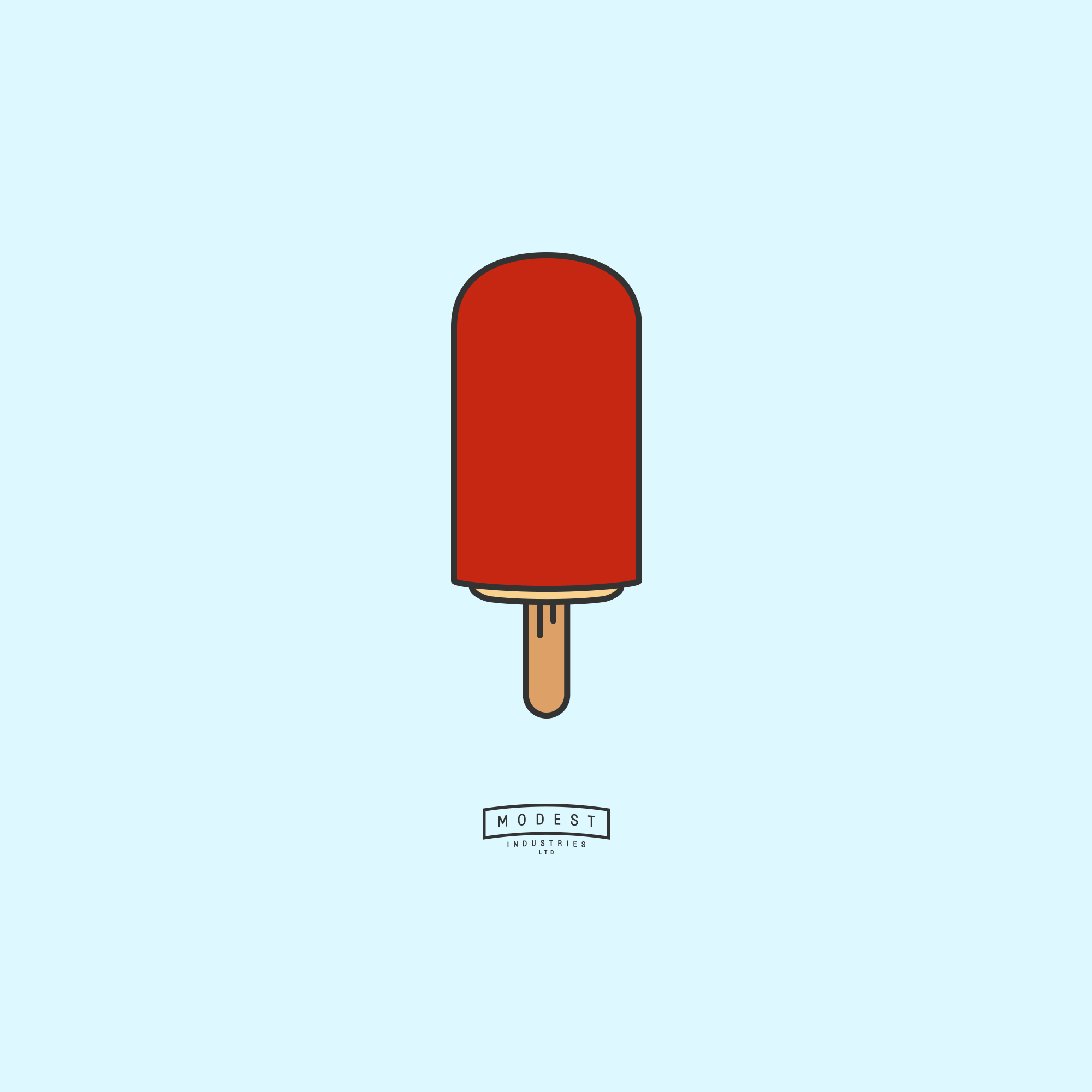
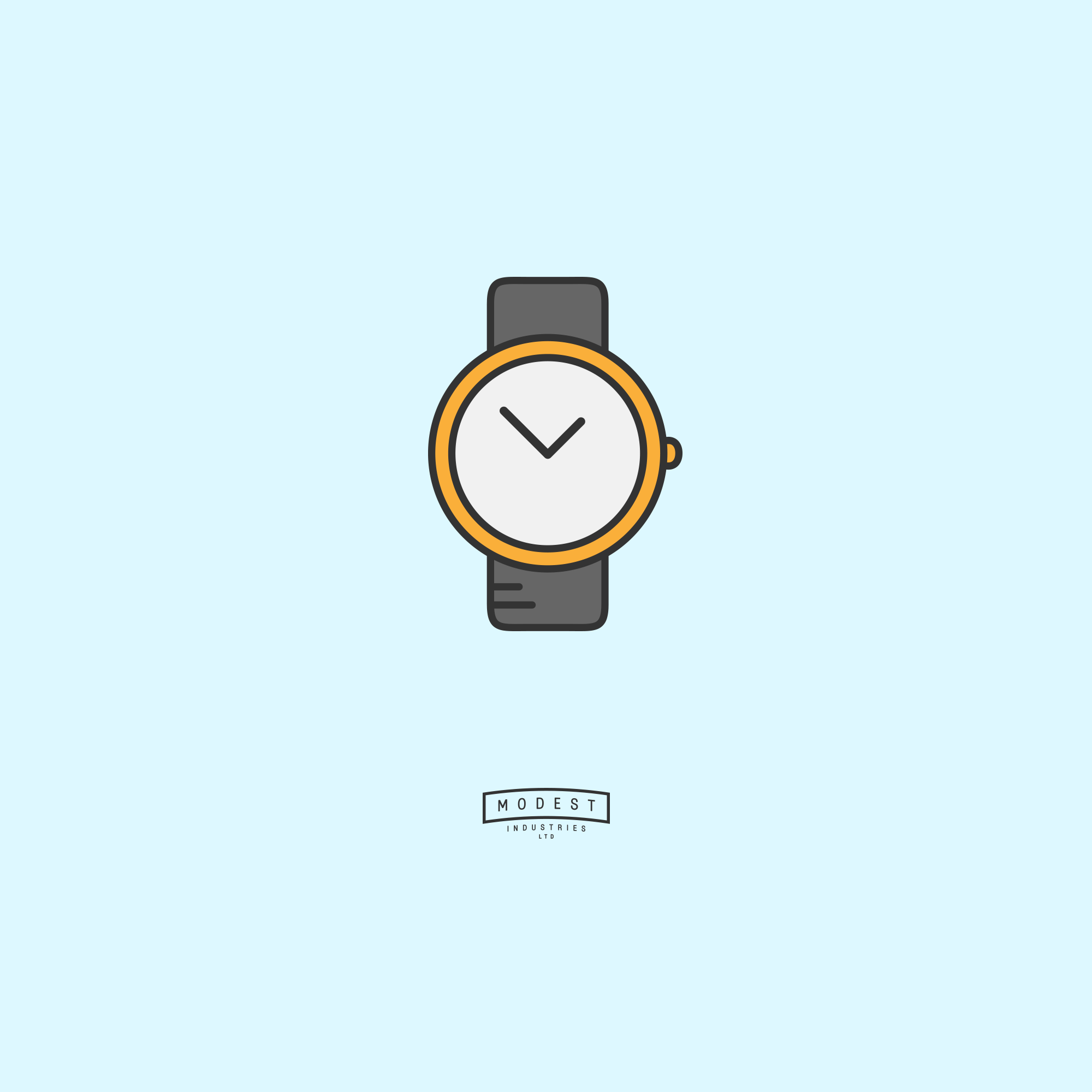
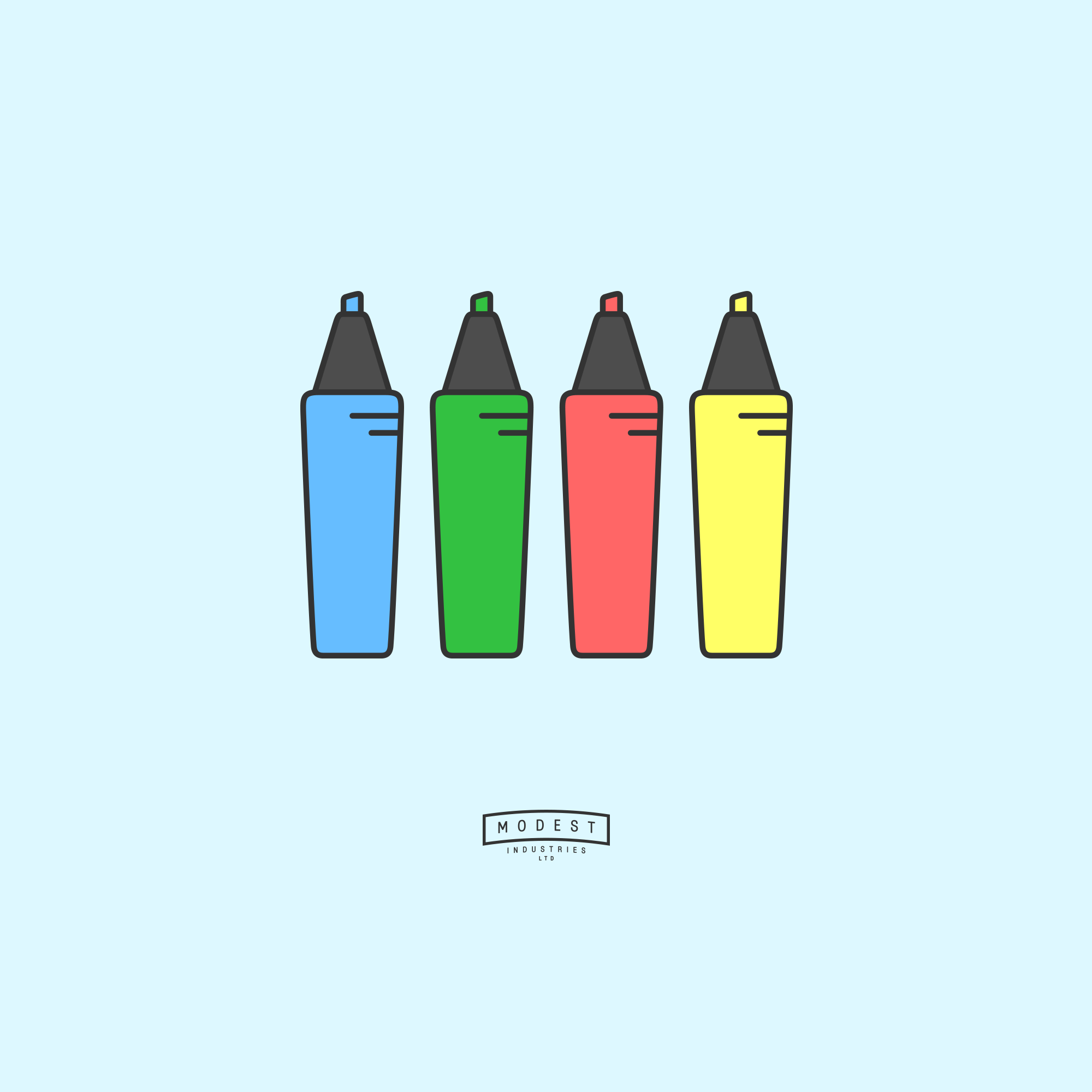
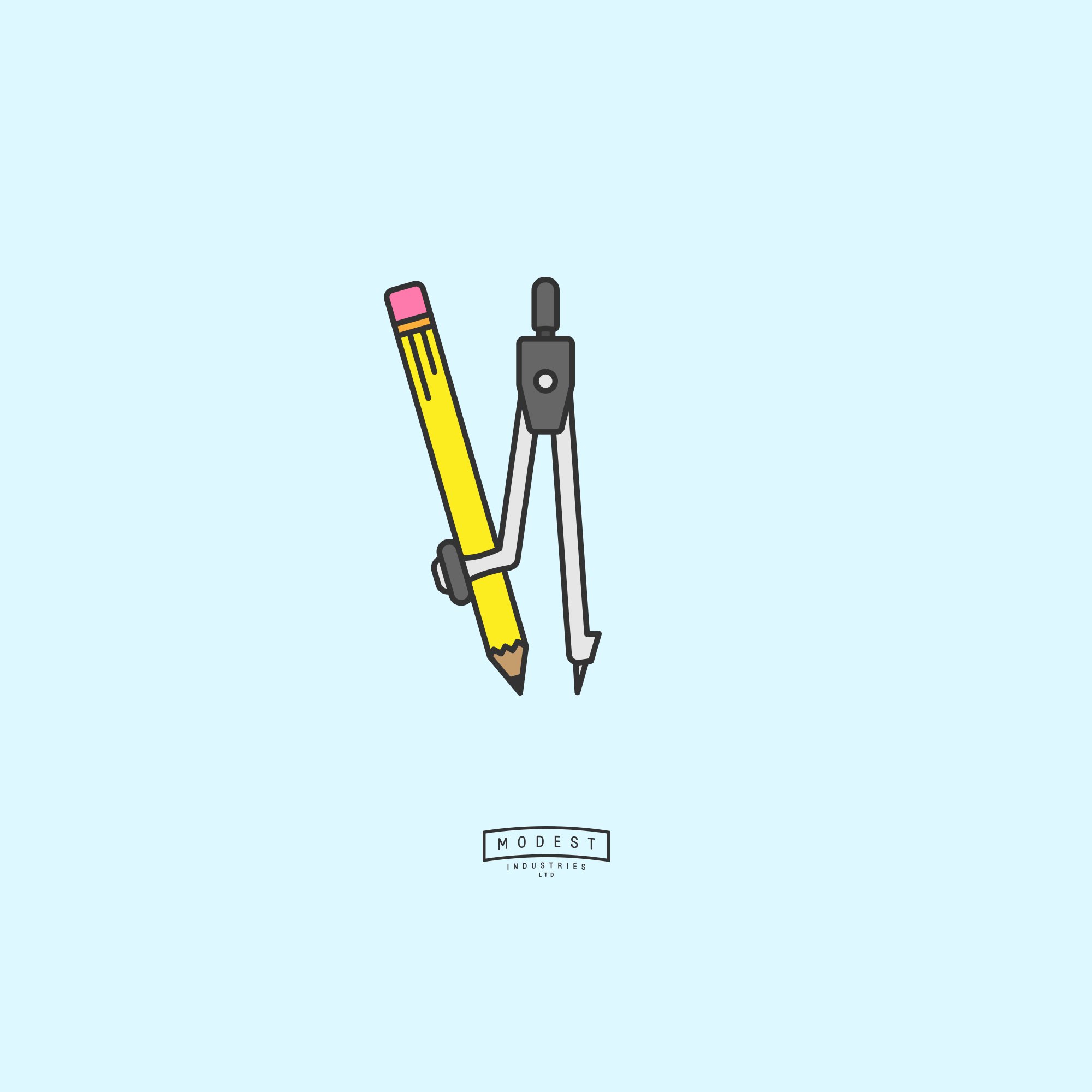
Icons, Icons, Icons
Iconography is one of my favourite ways of communicating through design, even my pizza icon proved popular enough to be published.
I knew that an icon driven approach would complement the modest style I was going for, and it all started with the pencil. The first icon I ever designed for Modest Industries. What's more modest, more unassuming than the humble pencil? Capable of creating masterpieces from nothing, sharing ideas and inspiring greatness. All from a splinter of wood with some granite pushed through the middle.
The icons were used on the website, in pitch decks and presentations, but they were just too perfect to not spread further, so I dedicated the @thisismodest Instagram feed to them – an icon series of simple objects designed in our minimal, modest style. Here are a few of my favourites.
 View Another ProjectVisit Modest Industries